

In today’s world, people’s focus is fleeting. Short attention spans make the design of printed magazines crucial. When moving from paper to digital, traditional layouts like saddle stitching face issues. But with smart design choices, your content can shine both in print and online.
Are you looking to create magazines with portrait orientation? Maybe you want to know about the newest printing technologies. This guide is here to assist. It will support you in making engaging magazines, covers, and more. Let’s make your content both captivating and easy to read.
Introduction to Optimizing Magazine Layouts
The magazine industry is flourishing, with a value of $100 billion. This tells us people all over the world still love magazines. Good magazine designs are key to keeping readers interested. We will look at how to make designs easy to read and visually attractive.
Importance of Readable Magazine Designs
Easy-to-read magazine formats are vital for readers. They make it simple for people to understand and enjoy. A smart layout not only makes reading fun but also helps the magazine look professional and credible. When magazines are easy to read, readers stay more connected. This can make them come back for more, building loyalty.
Key Aspects of a Well-Designed Magazine
Making a magazine that’s both beautiful and easy to read requires attention to detail. Every design piece needs to work well with others to guide readers and create a unified look.
- Headlines and Introductory Paragraphs: They set the mood and pull readers into the piece with ease.
- Body Copy: It fills the most space and must be easy to read through smart use of spaces and sections.
- Bylines and Subheadings: Bylines recognize the authors, while subheadings make text more approachable.
- Pull Quotes and Image Captions: They highlight important parts and give additional info on images.
- Section Heads and Folios: They help organize content and ease navigation.
- Box Copies/Panels: These highlight extra info, making articles more informative.
Keeping designs consistent (like fonts and layouts) is crucial. It helps create a magazine that looks and feels good to readers. By focusing on clear objectives, structure, and reading ease, designers can make sure their magazines grab readers’ attention. This enhances the joy of reading every page.
Establishing Magazine Purpose and Audience
In the ever-changing world of magazine publishing, it’s key to know your magazine’s goal and who you’re writing for. Magazines cover many topics, from fashion to food, drawing in different kinds of readers. Figuring out what your magazine is about and who will read it makes the publication more interesting and successful.
Defining the Magazine’s Mission
Setting the magazine’s mission early on is very important. This mission gives direction to what you write and how the magazine looks. Having a clear mission makes choices easier and ensures everything in the magazine fits its purpose.
Understanding Printing Magazine Categories
Magazines usually fall into three main types: general interest, special interest, and those for professionals. General interest magazines cover lots of topics that many people enjoy, including food, travel, and entertainment. They try to offer a broad range of articles for the public to enjoy.
Special interest magazines are more focused. They dive deep into areas like photography or mental health. They offer detailed articles and tips for those with a specific interest. For example, there’s National Geographic for travel lovers and Vogue for fans of style.
Makeshift magazine found an audience in people who care about the world and love creativity. They made their content and look to attract these readers, working with others to get ads and magazines out there.
Professional publications are for those interested in certain jobs or fields, like aviation or finance. These magazines share news and ideas that help people in these professions keep up with current events. They give professionals important information in their field.
Knowing about these magazine types and who will read your magazine helps. It allows publishers to shape the content and look to appeal to their target readers. This focus makes the magazine more enjoyable and connect better with its audience.
Mastering Hierarchy and Readability
In the magazine design world, hierarchy and readability are crucial. They help make reading enjoyable and accessible. By mastering them, designers lead readers smoothly through the content. This ensures the message is clear and understood.
Guiding Readers with Visual Hierarchy
Visual hierarchy arranges design elements so they flow logically. This lets readers know what’s important. Colour, size, font, and image positions all help do this.
Designers use big and small fonts, different colours, and smart image placement. This creates an easy path for the reader’s eye. It makes the pages look great and the text easy to read.
Enhancing Readability with Font Choices when creating Printing Magazine Layouts
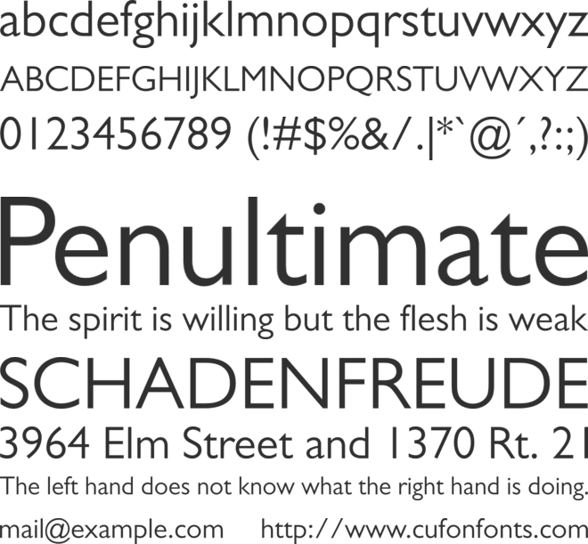
Making text easy to read is key in magazine design. The right font does a lot for how well we can read something. It also affects the magazine’s style and mood. So, designers pick fonts that are clear, have good space, and fit the topic.
For easier reading, body text should be between 14px and 24px, depending on the font. Large fonts, like 24px and 19px, are used by pros like Jeffrey Zeldman and Vogue.com to make reading better.
Designers should know how people read digital and print content. The F-pattern and Z-pattern are common ways people look at pages. Designers use this to make the layout and font choices great for reading and staying interested.
When designers get hierarchy and readability right, their magazines are fantastic. They keep readers interested from the first page. Using good content and visuals with these principles, magazines are enjoyable on any kind of reading platform.
Design Elements for Engaging Layouts
To create an engaging magazine layout, you need to mix compelling headlines, bold images, and well-written text. These elements come together to grab readers’ attention. This makes them want to explore the magazine’s content further.
Crafting Compelling Headlines and Subheadings
Headlines are key to getting readers interested. As David Ogilvy said, “five times as many people read the headlines as the body copy.” This shows how crucial it is to make headlines catchy. Subheadings act like a sneak peek, giving readers a taste of what’s to come. They should be short and sweet, sparking curiosity about the story.
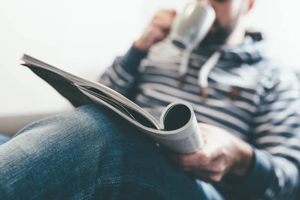
Captivating Imagery and Creative Image Use
Images are a major part of any magazine. They help explain the text and make the content more interesting. Choosing where to place images, their size, and how they align with text is important. This guides readers through the layout. Mixing images with headlines or as backgrounds can make the design more interesting.
Writing Effective Body Copy
After the headlines and visuals, the text is what really informs readers. Good body copy should be clear, concise, and engaging. Avoiding too many adjectives and using an active voice helps. It makes the text easier to read and more interesting. Talking to different people and doing your own research helps create content that readers will enjoy.
No matter if you’re making a cool magazine in Sydney or a detailed one in Melbourne, these elements are vital. They make sure your layout is intriguing and captures your readers’ interest.
Printing Magazine Considerations
Publishers work hard to make magazines that are beautiful. They focus on many printing details for the best outcome in both print and digital. This means picking the right paper and binding and preparing for various platforms. A lot of planning is needed to make sure readers enjoy a smooth experience, no matter how they read.
Paper Stocks and Binding Options
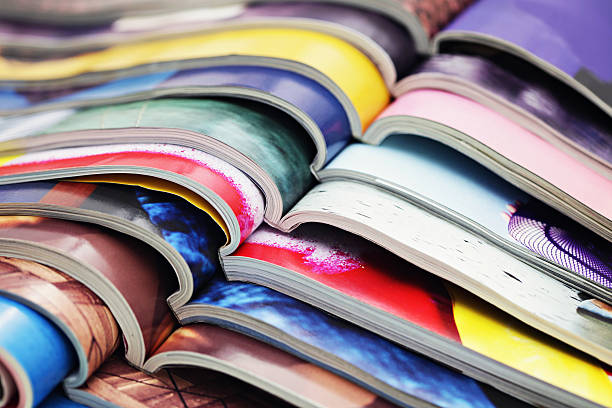
Choosing the right paper is key for how a magazine looks and feels. In Australia, there are many paper choices, from glossy to matte. Each type has unique features that match different styles and budgets. Glossy paper works well for bright, vivid designs. On the other hand, uncoated or matte papers give a classier, timeless look. These are often chosen for high-end markets or for a simple, clean design. Whatever paper is chosen, it should be strong, the right weight, and absorb ink well for the best reading experience.
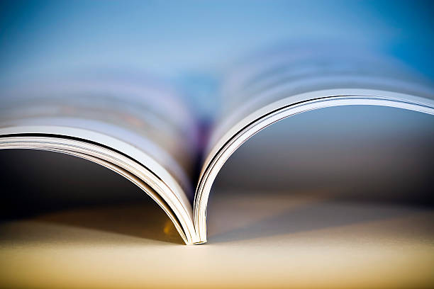
For binding, Australian publishers often choose between saddle stitching and perfect binding. Saddle-stitched magazines are good for thinner magazines as it’s cost-effective and lets the magazine lay flat, making saddle stitched booklets (or magazines) easier to read. However, perfect binding is better for magazines with more pages. It gives a strong spine and neat edges, like a book, or novel. Wire binding is not generally suited when printing magazines.
Optimizing for Print and Digital Formats
Publishers know that in today’s world, magazines need to look good in print and on screens. While many readers in Australia still like paper, digital formats are popular too. They offer easy access and fit with the fast pace of modern life.
Designing magazines to look great on any screen is essential. This way, they’re easy to read on devices ranging from small phones to big desktops. Adding things like videos and links makes the digital experience even better. It keeps readers interested and involved.
To be efficient, experts suggest designing magazines with the printing process in mind. This tip comes from professionals like Michele Santos, a 22-year veteran of the industry. It can save money and make sure the final product looks great in both print and digital. This brings everything together in a coherent, attractive way.
Advertising and Digital Integration for Printing Magazine Layouts
In today’s world, magazines are not just in print anymore. They mix print with digital to get more ads seen. This lets ads reach more people in a better way.
Maximizing Ad Space in Print and Digital
Print magazines give a real, hands-on experience. Ads in print can be very eye-catching. They stay in the reader’s mind.
In digital magazines, ads can move and be clicked on. This makes the ad experience more fun and interesting. It can include things like videos and links to learn more.
Incorporating Calls-to-Action and Interactive Elements
Digital magazines can ask you to do something (a call-to-action). Or they can let you play with the ad (interactive). This helps companies sell more. It makes ads more than just something to look at.
Using both print and online ads together is super smart. It matches what people see online with what they see in the real world. This makes ads more targeted and likely to be noticed.
Statistia estimates that 11 million households will scan a QR code in 2020 in the US, showing an increase from the 9.76 million QR codes scanned in 2018.
Trying new things, like QR codes, in digital magazine ads is cool. It lets people and companies see what works. And it gives interesting feedback on the ads.
Combining print and digital ads well tells a great story. It makes people see and remember the ad brand. Using this mix right can make a big difference in how people see and buy from the brand.
Layout Design Principles and Best Practices
Good design principles are key to making magazines that are attractive and keep readers interested. A great layout makes the reading experience better and helps the magazine’s ideas stand out.
Grid Systems and Text Flow
Grid systems help keep magazine pages looking neat and easy to read. Using a grid makes sure everything from text to images fits well together. Text should be 50 to 70 characters wide for the best look and readability.
Designing magazine spreads as a whole is emphasized over individual page design, allowing for a cohesive and visually compelling presentation across facing pages.
Typography Choices and Sizing
Choosing the right typeface is crucial for how the magazine feels to readers. You should carefully pick fonts, sizes, and styles to make the text clear and fitting with the magazine’s style. It’s about finding a size that is attractive but still easy to read.
Image Placement and Visual Hierarchy
Where you put images and how you show them is vital for an interesting design. Pictures are often more important than words in magazines like fashion. A well-planned layout can draw your eyes from one point to the next, making the reading journey smooth and appealing.
With the right grids, smart font choices, and strategic image usage, magazine designers can craft layouts that are engaging and clear. This way, they don’t just look good; they also share the magazine’s message and brand well.
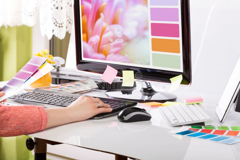
Software Tools for Printing Magazine Layout Design
The publishing world is always changing. To make their magazines look great, professionals use different software. Adobe InDesign is a top choice. It connects well with other Adobe programs like Illustrator and Photoshop. This makes it easy to design stunning magazines, booklets, and reports.
Choosing the best software for your magazine depends on its size, how it’s bound, and how you want the final product to look. Besides InDesign, options like Affinity Publisher, Canva, and QuarkXPress are great too. They offer features designed for specific needs.
Using the latest tech and software can make your design work faster and better. These tools help you make layouts that catch the eye, share information clearly, and stick in people’s minds, whether they’re in print or online.
Adobe’s Creative Suite is highly recommended. InDesign is especially good for laying out magazines, catalogues, and booklets.
When choosing software for your magazine, think about the kind of magazine you’re making. You might be working on a printed or digital project. The right software will help your creativity shine, while meeting the industry’s standards.
Looking at your budget is also important. Some software is sold with a one-time payment, others with a monthly fee. You can often try it for free or get a quote. This helps publishers find an affordable option for their project’s needs.
Printing Magazine Layouts : A Conclusion
In the world of publishing, making a printing magazine that’s interesting and draws people in is key. It’s about using your smarts, creativity, and understanding who you’re making the magazine for. Everything from the cover to the way the words look plays a part in keeping readers hooked.
To make a magazine that people from all walks of life enjoy, a publisher needs to stick to some rules. Have a clear goal, make it easy to see and read important stuff, add cool design bits, and use the right software. By doing this, people in Australia can make magazines that speak to many different types of readers.
Magazines can be bound in different ways, like saddle stitched or perfect binding, and choosing the right paper matters a lot. These choices affect how the final print looks and feels. You can pick from many glossy and landscape options to match your vision.
Moving with the times, publishers must also make magazines ready for the online world. They need to add things that readers can interact with and make it work well on all devices. This way, a magazine can be more than just a print. It can reach people in different ways, from a great cover to a deep booklet to an amazing online experience.