Make Your Print Advertising Stand Out with the Right Fonts
Print Advertising is an effective way to get your message across and make a statement. You can fill it with visuals, eye-catching graphics, and bold text.
But what good is great content if no one takes the time to read it? With the right printing font choice, you can draw in your audience and keep them engaged.
With so many fonts to choose from, it can be difficult to pick the ones that best fit your Print Advertisement. So here are our top 10 trending fonts for print media materials:
Arial
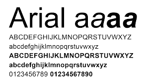
A classic, professional-looking typeface with a clean, modern feel.
Arial has been a popular choice for print ads for many years and is perfect for formal documents, such as business reports or brochures.
It’s also highly readable in small sizes, making it an ideal choice for print marketing materials.
Calibri
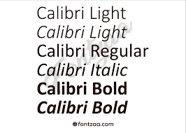
A sans serif typeface with distinct features such as rounded strokes and large x-heights, makes it more legible than other sans serif fonts.
Calibri is a modern font that works great for headlines and titles.
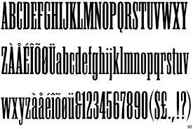
Helvetica
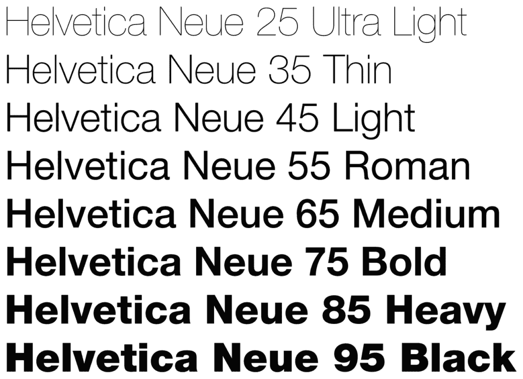
A timeless classic with a clean, modern look.
Helvetica is an iconic font choice for Print Advertisements, posters, and print marketing materials. Its versatility makes it suitable for both small and large text, and its readability makes it a great choice for longer documents. A favourite for designers ad editors in Newspaper Ads and Magazine Ads.
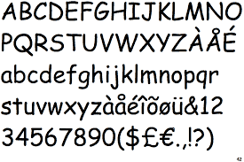
Century Gothic
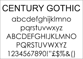
Originally Created in the early 20th century, Century Gothic is an elegant font that works well with both traditional and modern designs.
Its distinct letterforms make it perfect for headlines, as well as larger bodies of text.
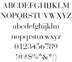
Garamond
Garamond is a timeless serif typeface with a classical, old-school feel.
It has been a popular choice for book covers and other print materials for centuries and its unique letterforms make it an ideal choice for titles and headlines.
Bodoni
Inspired by the works of Giambattista Bodoni, this font is a modern take on an old classic.
Bodoni has been used for book covers and posters for centuries and its unique letterforms make it perfect for headlines.
Futura
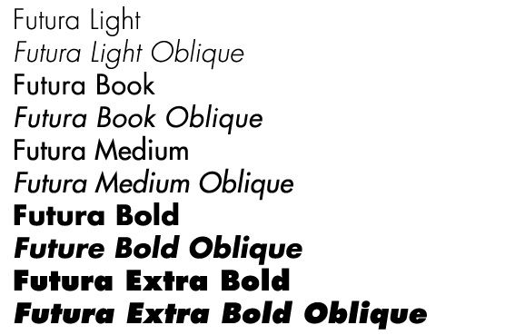
A clean, modern font created in the 1920s.
Futura is a great choice for titles and headings as its bold letterforms stand out from other typefaces.
It’s also highly legible in small sizes, making it a great choice for print materials.
Gill Sans
A classic font designed in the 1930s, Gill Sans is a humanist sans serif typeface with a modern touch.
Its unique letterforms make it an ideal choice for headlines and titles, but its readability also makes it suitable for longer bodies of text.
Baskerville
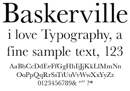
Created in the 18th century, Baskerville is a serif typeface that has been used for many book covers and other print materials.
Its unique letterforms make it perfect for titles and headings, but its readability also makes it suitable for longer bodies of text.
Trade Gothic
Created in the 1950s, Trade Gothic is a sans serif typeface with a bold, modern feel.
Its unique letterforms make it an ideal choice for headlines, but its readability also makes it suitable for longer bodies of text.
Clear as Mud? Good. But what Font has been voted the BEST for Print Advertising ?
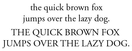
Times New Roman
The most popular font of all time, Times New Roman is a classic serif typeface that has been used for book covers and other Print Ads for decades.
Its unique letterforms make it perfect for titles and headings, but its readability also makes it suitable for longer bodies of text.
Times New Roman has been voted as the best font for print marketing by many professionals due to its timelessness and universal appeal.
Fonts that you don’t want to use for Print Advertising !
Comic Sans
With its fun, cartoonish letterforms,
Comic Sans has become one of the most widely used fonts in the world. Unfortunately, many people consider it to be an outdated and unprofessional choice for print advertisements.
If you’re looking to make a serious impression with your print marketing materials, Comic Sans is not the font for you!
In Print Advertising – What Font does everyone HATE !?
Papyrus
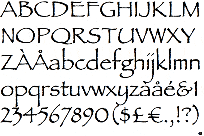
Papyrus is a popular font that has been used widely for book covers and other types of both print and digital marketing efforts.
Its unique letterforms make it an attractive choice, but its overuse makes it far too common to stand out in print materials.
Unfortunately, its unprofessional appearance and outdated feel have earned Papyrus the dubious title of being one of the most hated fonts in the world.
If you’re looking to make a professional impression with your print marketing materials, avoid Papyrus like the plague.
Font Sizing Matters in Print Advertising
Choosing the right font size is just as important as selecting the right typeface. Font size can make all the difference between an effective and ineffective piece of print marketing.
For body copy, aim for a font size that’s easy to read without straining. Generally speaking, 10-12pt is a good place to start.
For titles and headings, you can use a slightly larger font size to draw attention. 14-18pt is usually a good range for titles and headings.
There are no hard and fast rules when it comes to font sizing, so be sure to experiment with different sizes until you find the right one that works for your print advertising
Famous Font Styles you might recognise …
Star Wars
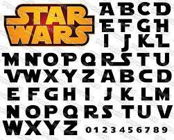
The iconic Star Wars font style has become iconic since its introduction in 1977.
It’s a bold, condensed font with sharp angles and diagonal lines that instantly evokes the space fantasy of George Lucas’s beloved universe.
This classic font style is perfect for creating a contemporary, modern look in print materials.
If you’re looking for a fun and unique font to use in your print marketing materials, the Star Wars style is definitely worth considering.
Terminator
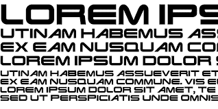
The Terminator font style is another popular font style that has become iconic since its introduction in 1984.
The font chosen for the movie was designed by Richard Starkings and based on Be Gone, a classic font style from the early 80s.
The Terminator font style is perfect for creating a retro, futuristic look in print advertising.
Its bold letterforms are eye-catching and its heavy lines make it perfect for titles and headings.
The Matrix
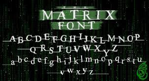
The Matrix font style is a classic, timeless font style that was introduced in 1999. Its minimalist letterforms make it perfect for creating a modern look in print materials.
Its clean lines are ideal for titles and headings, and its unique letterforms create an attractive contrast between light and dark elements.
The Matrix Font was based on the classic font style ITC Garamond and has been widely used in print advertising ever since its introduction.
Harley Davidson
The Harley Davidson font style is a popular font style that was introduced in 2003.
This classic script-style font is perfect for creating an eye-catching look in print materials. Its bold letterforms are attractive and its fluid lines make it perfect for titles and headings.
The Harley Davidson font style is also widely used in merchandising, apparel, and branding materials.
Its heavy letterforms create an attractive contrast between light and dark elements, making it a great choice for creating a memorable look in print advertising.
The Hobbit/Lord of the Rings
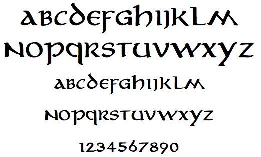
The Hobbit/Lord of the Rings font style is a classic, timeless font style that was introduced in 2003. Its bold letterforms are eye-catching and its heavy lines make it perfect for titles and headings.
The Hobbit/Lord of the Rings font style was designed by John Howe, who created the iconic logo for the movies.
It was based on the classic font style ITC Garamond and has been widely used in print materials ever since its introduction.
The Hobbit Print Campaign was one of the most successful print campaigns ever created and its font style was heavily used in the campaign.
Harry Potter
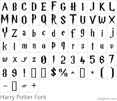
The Harry Potter font style is a classic, timeless font style that was introduced in 2007. Its bold letterforms are eye-catching and its heavy lines make it perfect for titles and headings.
The Harry Potter font style was designed by Warner Bros. and has been widely used in print materials ever since its introduction.
The Harry Potter font was based on the classic font style ITC Garamond and has been used in numerous Harry Potter-associated campaigns.
From movie posters to book covers, this fantastic font style has been featured on Print Advertising and Digital Marketing.
Titanic
The Titanic font style is a classic, timeless font style that was introduced in 1997.
Its bold letterforms are eye-catching and its heavy lines make it perfect for titles and headings.
The Titanic font style was designed by Twentieth Century Fox and has been widely used in print materials ever since its introduction.
This incredible font style was featured in the movie poster of the epic blockbuster and has been used on a plethora of print ads and digital ads in the movie industry since. `A Beautiful Mind’, Hotel Rwanda’ and Sex in The City all utilise this style
Ebay
Ebay is one of the most well-known eCommerce sites and its font style is just as recognizable. Eb ay’s font style was created by Monotype Imaging in 2006
The eBay font style is a modern, clean font style that was designed with the web in mind. Adrian Frutiger designed the font style with a focus on readability and legibility, making it perfect for digital ads.
It is widely used in web design as well as print materials such as book covers and brochures.
Nike
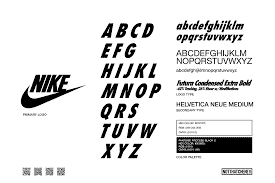
Nike’s font style is a bold, modern font style that gives any design an edge. The Nike font style was designed by Michael Neumann in 1985 and has since become one of the most recognizable fonts in the world.
The Nike font has been featured on an extensive array of print advertising such as billboards, packaging, apparel and books.
Based on the Futura Font created by Paul Renner, this font style is bold, stylish and contemporary. It is often used in advertising to give a modern edge and increase brand awareness.
Print Advertising Fonts… they are more than `just a font’
So there you have it! Many people will create a print advertisement using the default template offered in whatever program they are using to Design.
Effective Print Advertisements are tried and tested, created with a brand message and with a target market, or target demographic in mind.
Some fonts are not cheap and represent a substantial investment to buy to get your print advertising marketing campaign just right.
The Font you use to create your Print Advertising should capture your customer’s attention at first glance. A simple concept is often better than a complex one
Now you are a certified Font Guru – go create that amazing Print Advertising and watch it go viral!