


When it comes to the dynamic world of graphic design, understanding the fundamental differences between print and digital design is crucial for any designer aiming to make a significant impact in the industry. Here we will help explain essential graphics design tips including Visual Hierarchy, Color Palettes, the importance of brand colors, and many other elements of how to design for both Print And Digital
At first glance, these two mediums might seem to share a common foundation — after all, both revolve around creative aesthetics, composition, and conveying messages effectively. However, delving deeper reveals that they are distinct in their methods, requirements, and audience interactions.
Print design, the traditional cornerstone of the industry, is tangible, often held in hand, and has a physical presence that can make a lasting impression.
From the texture of the paper, and the color palette to the vibrancy of the inks, every element of print design contributes to the overall experience. It’s a world where precision is key, as designers must account for aspects like colour accuracy, print resolution, and physical dimensions.
On the other hand, digital design, which has surged in prevalence with the advent of the internet and mobile technology, speaks to the immediacy and versatility of the modern age.
It’s characterized by its dynamic and interactive nature, with designs that can adapt to various screen sizes, integrate multimedia elements, and evolve over time.
Digital design encompasses everything from websites and mobile apps to social media graphics, each with its own set of rules and best practices.
Navigating between these two realms requires not only a keen eye for design but also an understanding of their unique technicalities and user expectations.
As the lines between the digital and physical worlds continue to blur, the ability to adapt and excel in both print and digital design becomes not just an advantage, but a necessity for any graphic designer looking to leave their mark.
This article aims to explore these differences in detail, providing insights, graphic design tips and guidance for professional designers ready to master the art and science of graphic design in both its most enduring and its most evolving forms.
Importance of understanding these differences for graphic designers.
For graphic designers, grasping the design elements between print and digital design is more than just a professional requirement; it’s a strategic asset that elevates their work, fuels design inspiration and enhances their marketability.
In an era where brands strive to create cohesive experiences across multiple platforms, the ability of a designer to fluidly navigate between print and digital realms is invaluable. This versatility not only broadens a designer’s creative horizons but also opens up a wider array of job opportunities and projects.
Moreover, a deep understanding of these differences empowers designers to make informed decisions that enhance the effectiveness of their work. Whether it’s choosing the right colour schemes for print’s CMYK model or optimizing layouts for various digital screens, each decision impacts how the audience perceives and interacts with the design.
In essence, the knowledge of how to tailor design strategies for each medium can significantly boost a brand’s communication and engagement, making it a critical skill for any graphic designer in today’s visually driven world.
Understanding the Mediums
Definition and characteristics of print media (magazines, brochures, posters).
Print media, encompassing a diverse array of formats such as magazines, brochures, and posters, stands as a testament to the enduring power of physical design in an increasingly digital world.
This medium is defined by its tangible nature, allowing audiences to physically interact with the material, be it through turning the pages of a magazine, unfolding a brochure, or viewing a poster on a wall. The tactile and physical environments of print media add a dimension of sensory engagement that digital media cannot replicate.
Magazines often blend high-quality imagery with engaging text, creating a visually rich experience of multi-page designs that invite prolonged reading and contemplation, typically using the same tones throughout/
Brochures, on the other hand, are designed for concise, impactful communication, often utilizing folds and panels to guide the reader through information in a structured way.
Posters are a study in the art of attraction and brevity, typically using bold visuals and minimal text to capture attention and convey messages quickly and effectively.
In all these forms, print media relies on careful consideration of colour schemes, typography, and image quality, as these elements must be meticulously planned to ensure clarity and consistency in the final printed product.
The permanence of print also demands a high level of precision in design, as any errors or misjudgments become indelible once the item is produced.
Despite the rise of digital alternatives, print media continues to hold a significant place in the realm of graphic design, valued for its physicality, permanence, and the unique sensory experiences it offers.
Definition and characteristics of digital media (websites, apps, social media graphics).
Digital media in graphic design encompasses an array of platforms including websites, apps, and social media graphics, each defined by its unique characteristics and functionalities.
At its core, digital media is distinguished by its interactive and dynamic nature, catering to an audience that engages with content on screens of various sizes, from smartphones to desktop monitors.
Websites, a central element of digital media, are designed with user experience in mind, prioritizing navigability, responsiveness, and the ability to adapt to different devices and screen resolutions.
Apps extend this interactivity further, offering personalized user experiences with designs that are both functional and aesthetically pleasing, often utilizing touch-based interfaces.
Media graphics, on the other hand, are crafted to capture attention in a fast-paced, scroll-heavy environment, requiring designs that are not only visually striking but also optimized for quick consumption and shareability.
These graphics often need to align with the specific standards and aesthetics of each social media platform.
Overall, digital media design focuses on creating engaging, user-friendly experiences that leverage technology’s capabilities to connect and communicate with audiences effectively in the digital realm.
Brief history and evolution of both mediums in the context of graphic design.
The history and evolution of graphic design in both print and digital mediums paint a fascinating picture of artistic progression and technological innovation.
Print design’s roots trace back to ancient civilizations, where symbols and images were used to communicate and tell stories. This age-old practice evolved significantly with Johannes Gutenberg’s invention of the movable type printing press in the 15th century, revolutionizing the production of books and printed materials that still remain dominant today.
The subsequent centuries witnessed continued advancements in printing techniques, leading to the birth of modern graphic design in the early 20th century, characterized by the emergence of advertising, branding, creating graphics and utilising typography and images in a commercial context.
The digital medium, in contrast, is a product of the technological revolution of the late 20th century.
The advent of personal computers in the 1980s, followed by the internet in the 1990s, heralded a new era for graphic design. Digital design was propelled forward by the development of graphic design software, allowing for unprecedented creativity, enhancing the medium’s most impactful elements and experimentation.
This period saw the rapid transition from print to digital, with designers embracing the new medium’s ability to create dynamic, interactive, and multimedia content creating space for an entirely new market.
The proliferation of mobile devices and social media in the early 21st century further transformed digital design, making it more accessible and integrated into daily life.
Today, the lines between print and digital design are increasingly blurred, with many principles and elements being shared across mediums. However, each retains its unique characteristics and continues to evolve with technological advances and changing consumer behaviours.
This historical journey highlights not only the transformative power of technology in graphic design but also the enduring value of traditional principles and techniques that have shaped the field.
Colour Models and Their Impact
Explaining RGB (Red, Green, Blue) for digital screens.
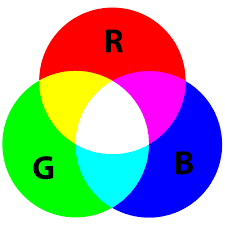
In the realm of digital design, the RGB colour model plays a pivotal role, standing as a fundamental concept that every graphic designer must master.
RGB, an acronym for Red, Green, and Blue, is a colour model used for digital screens, including everything from computer monitors and smartphones to television sets.
This model operates on the principle of additive colour mixing, where the primary colours of light—red, green, and blue—are combined in various ways to produce a broad spectrum of colours.
When these primary colours are mixed together in different intensities, they create the myriad of hues and shades we see on digital screens. For instance, combining red and green light at full intensity produces yellow, blue and green making cyan, and red and blue create magenta.
Notably, when all three colours are combined at their maximum intensity, they produce white light. In contrast, the absence of these colours results in black.
This colour model is integral to the way digital screens display colours, and understanding it is crucial for designers, especially when the design process involves digital media, to ensure their work appears as intended across various devices and screens.
Explaining CMYK (Cyan, Magenta, Yellow, Key/Black) for print.
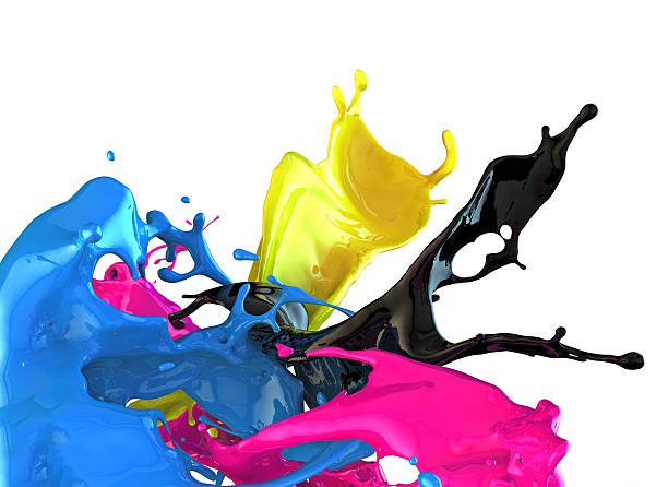
CMYK, an acronym for Cyan, Magenta, Yellow, and Key (Black), is the cornerstone focal point colour model used in print design.
This subtractive colour model works by layering different hues, each absorbing specific wavelengths of light, from the background image to the foremost visual elements, to create a wide spectrum of colours.
Unlike digital designs that rely on the light-emitting RGB (Red, Green, Blue) model, CMYK uses the physical blending of these four ink colours on paper to produce the desired visual outcomes.
When designing for print, understanding CMYK is essential, as it directly impacts the accuracy and vibrancy of the printed product. Each of the four ink colours is applied in varying percentages, and their combination subtracts brightness from white (the usual colour of the paper), producing the intended colours.
The ‘Key’ or Black ink adds depth and detail, enhancing the richness and contrast of the image. This process is fundamental in everything from simple brochures to elaborate packaging, making CMYK an indispensable part of a graphic designer’s print toolkit.
Mastery of the CMYK model ensures that the colours envisioned on the screen are those that come to life in the final printed piece, maintaining design integrity and client satisfaction.
How colour models affect design decisions and final output.
Colour models play a pivotal role in shaping the design decisions and final output in graphic design, acting as a fundamental bridge between a designer’s vision and the viewer’s perception.
In print design, the CMYK (Cyan, Magenta, Yellow, Key/Black) colour model is utilized, where colours are created through a subtractive process, blending pigments to absorb light.
This model is essential for ensuring that the colours conceived on-screen translate effectively to paper, as variations in paper type, ink quality, and printing process can all impact the final hue.
On the digital front, designers work with the RGB (Red, Green, Blue) colour model, where colours are formed through an additive process, mixing light to create various colours.
This model is crucial for screen-based designs, as it aligns with the way monitors emit light, ensuring that the colours displayed are vibrant and true to the designer’s intent.
Understanding these colour models is vital for designers, as it influences everything from the mood and tone of the design to its readability and accessibility.
By mastering the intricacies of CMYK and RGB, designers can make informed decisions that enhance the effectiveness of their work, whether it’s a printed brochure or a digital advertisement (there really isnt a visual hierarchy when comparing), leading to outputs that not only catch the eye but also convey messages in the most visually appealing and accurate way.
Resolution and Image Quality

Importance of resolution in print (DPI – dots per inch) vs. digital (PPI – pixels per inch).
Resolution plays a pivotal role in both print and digital designs, but it’s essential to understand how it differs between these mediums to ensure optimal visual quality.
In print design, the resolution is measured in DPI (dots per inch), which indicates how many ink dots the printer can place within a one-inch space.
The higher the DPI, the sharper and more detailed the printed image will be. This is crucial for print work because once an image is printed, any pixelation or blurriness caused by low resolution cannot be corrected.
Print projects typically require a resolution of at least 300 DPI to ensure clarity and detail, especially for professional-quality brochures, magazines, and posters.
In contrast, digital design uses PPI (pixels per inch), reflecting the number of pixels displayed per inch on a screen.
Digital screens display a fixed number of pixels, so the resolution in digital design is less about print quality and more about the pixel density of the display.
Higher PPI can lead to crisper images, especially on devices with high-resolution displays like smartphones and tablets.
However, unlike print, digital designs must also consider file size and loading times, especially for web use, balancing high-quality visuals with efficient performance.
Understanding these nuances in resolution for both print and digital mediums is critical for designers to produce work that not only looks fantastic but is also appropriately tailored to its intended platform.
Common mistakes related to image quality and how to avoid them.
The impact of screen size and device type on digital layouts.
The impact of screen size and device type on digital layouts is a critical consideration in modern graphic design.
Unlike print design, where dimensions are fixed, digital designs must fluidly adapt to a myriad of screen sizes – from the expansive monitors of desktop computers to the compact screens of smartphones.
This variability demands a responsive design approach, where layouts dynamically adjust to provide an optimal viewing experience across different devices.
For instance, a website that looks spacious and detailed on a desktop might need to reorganize its elements to maintain usability and aesthetic appeal on a smartphone.
This often involves re-scaling images and other elements, altering navigation menus, and restructuring content placement. In some cases, the entire color palette may need restructuring.
Additionally, designers must consider the varying interaction modes of devices, such as touchscreens on mobile devices versus mouse and keyboard on computers, which can significantly influence the design’s functionality and user interface.
The challenge lies in creating a cohesive design that maintains brand consistency and user engagement, regardless of how or where it is viewed, making screen size and device type two of the most pivotal factors in the realm of digital design.
Considering physical dimensions and bleed in print layouts.
In the realm of print design, two critical factors that significantly influence the final outcome are the physical dimensions and bleed.
The dimensions of a print project dictate the canvas size on which a designer works, be it a business card, brochure, or billboard. These dimensions are not just about the size but also about the aspect ratio and orientation, which play a key role in how the design is perceived and interacted with.
Equally important is the concept of bleed, an essential component in print design that ensures your final printed piece looks as intended.
Bleed refers to an extra margin around the design which extends beyond the final cut size. This area is crucial because it accounts for any slight inaccuracies in the cutting process. If bleed is not supplied, there will be a white space / border around your print job.
Without a proper bleed, designs may end up with unwanted white edges or important elements being trimmed off. This can significantly affect the aesthetics and professionalism of the final printed product, and make an originally successful design become obsolete.
A designer must meticulously plan for bleed when creating graphics, ensuring that any background colours or images extend into this area, while keeping crucial text and design elements safely within the ‘safe zone’, away from the edges.
This attention to detail in considering physical dimensions and bleed is what differentiates a well-executed print design from one that falls short of perfection. In print, learning what bleed is when doing your own designs is one of the first design skills to master.
Talk to your print supplier if unsure, but the hard and fast rule is a minimum of 2.5mm bleed. Ensure your design to this overall size (including bleed) when you begin creating the body copy. If you want the print to go to the edge of the sheet, this is the most important element at the beginning of the design process. The alternative is to have white empty spaces / border around the page.
98% of all branding assets that are printed have bleed. Ensure you have your illustrations aligned and body text is away from the bleed area.
Adapting designs for responsive digital environments vs. static print formats.
Adapting designs for responsive digital environments versus static print formats is akin to choreographing a dance for two very different stages.
In the digital realm, designs must be fluid and adaptable, capable of gracefully transitioning across a myriad of screen sizes and mobile device variations. This responsiveness ensures that the user experience remains seamless and engaging, whether the audience is viewing the design on a compact smartphone or a widescreen monitor.
It’s a dynamic environment where elements such as layout, image scaling, and typography must be meticulously crafted to maintain integrity and readability across all platforms.
In contrast, print design is a study of precision and permanence. Once a design is printed, it remains unchanged, fixed in its dimensions and form.
This static nature demands a different approach, where the designer must anticipate and resolve all elements of the design — from colour schemes to font sizes — in a singular, unchanging format.
The artistry in print design lies in creating a composition that is not only visually compelling but also perfectly tailored to its physical medium, be it a brochure, poster, or magazine spread.
Thus, while digital design is like a chameleon, constantly adapting and evolving, print design is a carefully composed portrait, timeless and unyielding.
Graphic Design Tips on Typography
Differences in font rendering on screen vs. print.
The rendering of fonts on screen versus in print is a critical aspect of graphic design that significantly influences the final appearance and effectiveness of a design.
On-screen, fonts are displayed through the light emitted by pixels, making them subject to variations based on screen resolution, brightness, and contrast. This can lead to challenges in maintaining clarity, especially at smaller sizes, necessitating the use of screen-optimized fonts that prioritize legibility and crispness.
Digital fonts often employ anti-aliasing, a technique that smooths the edges of letters to reduce the pixelated appearance. In contrast, the print design relies on the absorption and reflection of light from ink or toner on paper, providing a more consistent and controlled rendering of fonts, particularly bold fonts.
The physical nature of print allows for finer details and a broader range of subtleties in typography, such as delicate serifs and thin strokes, which may be lost or distorted on screens.
Choosing the right fonts is a fundamental part of the design journey. Print fonts must account for factors like ink spread and paper quality, which can affect the sharpness and exactness of the printed text.
Understanding these differences is essential for designers, as the choice and treatment of fonts must be tailored to the medium to ensure that the intended message is communicated effectively and aesthetically.
Licensing and usage rights for digital vs. print fonts.
When it comes to the world of typography, the realm of licensing and usage rights for fonts plays a crucial role, particularly when distinguishing between digital and print mediums.
For print projects, font licenses typically focus on the number of prints or publications in which the font will be used.
These licenses are generally straightforward, with the main consideration being the scale of distribution.
For example, a font used in a local magazine has different licensing requirements compared to one used in a national advertising campaign.
On the digital front, however, the complexity increases. Digital font licensing often considers not just the scale but also the nature of usage.
This includes aspects such as web embedding, where fonts are displayed on websites, or app licensing, where fonts are used within software applications.
Additionally, digital fonts may require licenses based on the number of website visitors or the number of app installations. This complexity is due to the digital font’s ability to be copied and distributed more easily than its print counterpart.
Therefore, when selecting fonts for a project, designers must be acutely aware of these differences in licensing and usage rights to ensure compliance and avoid potential legal issues.
This careful consideration is key to maintaining both the integrity and legality of their design work in diverse mediums.
Graphic Design Tips for legibility and readability in each medium.
When it comes to graphic design, whether in print or digital mediums, legibility and readability are paramount.
For print design, this involves selecting fonts and type sizes that are clear and easy to read on the physical page. Consideration of the spacing between lines (leading) and the space between characters (kerning and tracking) is vital to prevent visual clutter or strain.
High-contrast colour schemes are often preferred to ensure that the text stands out against its background. Additionally, the choice of paper and ink can greatly affect readability, as glare or bleed-through can hinder the text’s visibility.
In digital mediums, legibility and readability adapt to the unique challenges of screens. Here, designers must account for the variability of display sizes and resolutions.
Responsive typography, which adjusts to screen size and orientation, is crucial.
Fonts should be crisp and scalable, avoiding decorative styles from a font family that may become illegible on smaller screens.
Adequate contrast remains important, but with a mindful approach to brightness and colour combinations that are comfortable for long periods of screen viewing.
Additionally, designers should consider the impact of different devices and lighting conditions on the viewing experience, ensuring that text remains accessible in a range of scenarios.
By adhering to these best practices, designers can ensure that their work is not only aesthetically pleasing but also accessible and easy to engage with, regardless of the medium.
User Interaction and Experience
Interactive elements in digital design (links, animations, hover effects).
Interactive elements are the cornerstone of digital design, setting it apart from the static nature of print.
These dynamic features, such as hyperlinks, animations, and hover effects, not only enhance the visual appeal but also significantly improve user engagement and experience.
Links, the fundamental interactive component, guide users through a digital landscape, seamlessly connecting various pieces of content and fostering an intuitive navigation system.
Animations add a layer of sophistication and engagement, capturing the user’s attention and often simplifying complex information into digestible, visually appealing sequences.
Hover effects, on the other hand, provide immediate feedback to users, subtly indicating interactive or clickable elements, thereby enriching the usability and accessibility of the design. These interactive elements, when thoughtfully integrated, transform a static design into an immersive and interactive experience, encouraging users to explore, engage, and connect with the content in a more meaningful way.
In the digital realm, where user interaction is key, these elements are not just decorative but functional, playing a pivotal role in the success of the design.
Graphic Design Tips for print design (paper texture, finishes).
The tactile experience in print design is a unique and often underappreciated aspect that sets it apart from its digital counterpart.
This physical dimension of design plays a crucial role in how the audience interacts with and perceives a piece.
Different paper textures, ranging from smooth, glossy finishes to rough, matte surfaces, can significantly alter the feel and appearance of a design. The choice of paper not only affects the visual aesthetics but also the way it feels in the hands of the reader, adding a layer of sensory engagement that digital designs cannot replicate.
Additionally, finishes such as embossing, foil stamping, or UV coating can further enhance the tactile experience, providing a sense of luxury or emphasizing certain elements of the design.
These tactile qualities contribute to the overall impact of the design, often leaving a lasting impression on the audience, and are a testament to the enduring power and charm of print design in an increasingly digital world.
Designing for user engagement in both mediums.
Designing for user engagement in both print and digital mediums is a multifaceted challenge that requires a deep understanding of the audience’s needs and expectations.
In print design, user engagement is driven by the tactile experience – the feel of the paper, the quality of the print, and the overall physical interaction with the material.
Designers must consider elements like layout, visual hierarchy, and the strategic use of colours and images to create a compelling and memorable experience. The goal is to craft a design that not only attracts attention but also encourages the audience to spend time with the material, whether it’s a brochure, poster, or packaging.
In the digital realm, engagement hinges on interactivity and responsiveness. Here, designers must ensure that their creations are not only visually appealing but also intuitive and easy to navigate.
This involves understanding user interface (UI) and user experience (UX) principles, such as designing for various screen sizes, optimizing loading times, and incorporating interactive elements like buttons, links, and animations.
Digital designs should invite the user to explore, click, and engage with the content, creating an immersive experience that goes beyond mere viewing.
Ultimately, whether in print or digital, the key to successful user engagement lies in creating designs that resonate with the target audience, delivering both aesthetic appeal and functional value.
This balance is essential in capturing and retaining user attention, making the design not just a visual treat but a gateway to a more profound and engaging experience with the brand or message.
File Formats and Delivery
Suitable file formats for digital (e.g., JPG, PNG, SVG) and print (e.g., PDF, TIFF).
One of the best Graphic Design Tips we can impart is that selecting the appropriate file format is pivotal for ensuring the quality and effectiveness of your work, whether it’s for digital or print mediums.
For digital designs, commonly used formats include JPG, PNG, and SVG. JPG files are ideal for photographs and complex images due to their ability to compress file sizes without a significant loss in quality, making them perfect for web use where loading speed is crucial.
PNG files, on the other hand, are preferred for designs that require transparency, such as logos or graphics overlaying a background. They offer lossless compression, ensuring clarity and crispness.
Preparing files for web upload vs. print production.
Preparing files for web upload and print production is an exercise in understanding the unique demands of each medium.
For web uploads, the focus is on maintaining visual fidelity while optimizing for speed and responsiveness.
Designers typically use formats like JPEG, PNG, or SVG, which are ideal for digital screens. These formats are selected based on their ability to balance quality with file size, ensuring that images load quickly without compromising their appearance.
Additionally, considerations for web design include ensuring that images are responsive, meaning they adapt seamlessly to various screen sizes and resolutions. This often involves creating multiple versions of the same image, each optimized for different devices.
In contrast, preparing files for print production requires a different approach.
Here, the emphasis is on high resolution and color accuracy. Designers often work with CMYK color mode to match the printing process and use formats like TIFF or high-quality PDFs, which preserve the image quality and detail.
Print files must also account for bleed, which is the area that extends beyond the edge of the page to ensure no unprinted edges occur in the final product.
Additionally, designers need to consider the type of paper and printing method, as these can significantly affect the final appearance of the design.
Understanding these nuances is crucial for achieving the desired outcome, whether it’s a sharp, vibrant print or a fast-loading, visually appealing web graphic.
Understanding compression, file sizes, and loading times for digital designs.
Understanding compression, file sizes, and loading times is a critical aspect of digital design that significantly impacts user experience and accessibility.
In the digital realm, where designs are often viewed on various devices and internet speeds, optimizing file sizes without sacrificing quality becomes a balancing act. Compression techniques play a pivotal role in reducing file sizes and making images and graphics more web-friendly.
Effective compression can significantly decrease loading times, a crucial factor in user engagement and SEO rankings, as faster-loading pages are more likely to retain viewers and perform better in search engine results.
However, over-compression can lead to loss of detail and clarity in images, negatively affecting the visual appeal.
Designers must be adept at using formats like JPEG, PNG, or SVG appropriately, each offering different advantages in terms of quality and file size.
Mastery in optimizing images and graphics for web use involves understanding these formats, compression techniques, and their impact on both the aesthetic quality of the design and the overall functionality of the website or digital platform.
This careful consideration ensures that digital designs are not only visually stunning but also perform efficiently in the fast-paced digital environment.
Sustainability and Cost Considerations
Environmental impact of digital vs. print media.
The environmental impact of digital versus print media is a topic of increasing importance in our eco-conscious world.
Print media, traditionally reliant on paper, ink, and physical distribution, has long been scrutinized for its consumption of natural resources, particularly trees, and its carbon footprint due to transportation and production processes.
The use of chemicals in inks and finishes, along with the challenge of recycling some printed materials, further adds to its environmental toll.
On the other hand, digital media, often perceived as a greener alternative, comes with its own set of ecological implications. The energy consumption associated with powering digital devices, servers, and data centres, which are necessary for creating, storing, and accessing digital content, contributes significantly to global energy demands and, consequently, carbon emissions.
Moreover, the life cycle of electronic devices and the issues surrounding electronic waste disposal pose additional environmental challenges.
Therefore, while digital media reduces the need for physical materials, its environmental impact is not negligible and warrants consideration in discussions about sustainable media practices.
Both mediums carry distinct environmental footprints, and the key lies in striking a balance and employing sustainable practices in both domains to minimize their ecological impacts.
Cost factors in production and distribution for both mediums.
The cost factors involved in production and distribution for both print and digital mediums play a pivotal role in the decision-making process for designers and businesses alike.
In print design, costs are often tangible and upfront, encompassing expenses like paper, ink, printing processes, and physical distribution. These costs can vary significantly based on the quality of materials, the complexity of the design, and the quantity produced.
For instance, specialized printing techniques such as foil stamping or embossing, and high-quality paper stocks, can elevate the cost, but also the perceived value of the printed materials.
Additionally, distribution costs for printed materials can be substantial, especially when considering factors like shipping, storage, and handling.
In contrast, digital design typically involves lower direct production costs, as it bypasses material and physical distribution expenses.
However, it’s not without its own set of costs. These include expenses related to software subscriptions, web hosting, digital distribution, and potentially, fees for online platforms or marketplaces.
Furthermore, the cost of maintaining digital content over time, through updates or redesigns to keep up with evolving technology and trends, should also be considered. While the initial outlay may be lower compared to print, the ongoing investment in keeping digital content relevant and engaging can add up.
Ultimately, the choice between print and digital mediums should be guided not just by aesthetic preferences, but also by a thorough understanding of these cost implications.
Each medium offers its own value and impact, and balancing these costs against the potential return on investment is key to successful graphic design projects.
Balancing budget and impact in design decisions.
Balancing budget and impact in design decisions is a critical skill for graphic designers, often likened to walking a tightrope between practical constraints and creative aspirations.
In the realm of print design, this balance involves considering the costs of materials like ink, paper, and the printing process itself. High-quality finishes or unique paper types can elevate a design but may also significantly increase production costs.
Digital design, while free from physical material costs, brings its own budgetary considerations, especially in terms of software, platform-specific requirements, and potentially the need for specialized skills like animation or coding.
Here, the challenge lies in creating visually compelling and functionally robust designs without incurring excessive digital development costs. The key to striking this balance is rooted in understanding the client’s objectives and target audience.
By prioritizing the elements that maximize user engagement and align with the project’s goals, designers can make strategic decisions that optimize the impact of the design while conscientiously managing the budget.
This approach ensures that every dollar spent contributes directly to the effectiveness and success of the design, whether it’s in print or digital form.
Case Studies and Examples
Real-world examples of successful print and digital designs with Industry Leaders.
In the realm of graphic design, there are numerous shining examples of successful print and digital designs that have left an indelible mark in their respective domains.
In print, one iconic example is the Starbucks holiday cup, which has become a cultural symbol, marking the onset of the holiday season. These cups, with their ever-evolving yet consistently festive designs, perfectly encapsulate the brand’s identity and the spirit of the season, demonstrating the power of print design in creating tangible, memorable experiences.
In the digital sphere, Airbnb’s website and app design stand out for its intuitive user interface and immersive experience. The platform’s design seamlessly guides users through a vast array of listings with a clean, inviting layout and interactive elements that make browsing a pleasure.
This digital design not only enhances user experience with impactful elements but also solidifies Airbnb’s reputation as a user-friendly and reliable service. Both examples highlight how the principles of good design can be expertly applied across different mediums, each maximizing the unique advantages of print and digital formats to create impactful, enduring designs.
Comparative analysis of a campaign executed in both mediums.
The comparative analysis of a marketing campaign executed in both print and digital mediums offers a fascinating study of adaptation and audience engagement.
Take, for instance, a campaign launched by a renowned beverage company. In its print form, the campaign featured striking posters with high-resolution images and vibrant colours that captured the essence of the brand.
These posters were strategically placed in high-traffic areas, designed to create a lasting visual impact and reinforce brand recognition. Each element, from the choice of paper to the typography, was meticulously crafted to appeal to the senses in a tangible, enduring way.
Transitioning this campaign to the digital realm, however, required a different approach.
The same visual themes were adapted for various digital platforms but with an added layer of interactivity. Social media graphics were designed to encourage user engagement through likes, shares, and comments, fostering a sense of community around the brand.
On the website, animations and video content brought the campaign’s story to life, offering an immersive experience. The digital campaign was also tailored to leverage the advantages of online analytics, enabling real-time adjustments based on user interactions and engagement metrics.
This comparative analysis shows how the same core concept of a campaign can be effectively translated across mediums, each with its own strengths.
The print campaign excelled in creating a tactile, memorable experience, while the digital campaign offered interactivity, personalization, and data-driven adaptability.
Together, they demonstrate the power of a multi-faceted approach in modern marketing, appealing to diverse audiences and maximizing the impact of the campaign’s message.
Lessons learned and best practices illustrated through case studies.
The comparative analysis of a marketing campaign executed in both print and digital mediums offers a fascinating study of adaptation and audience engagement.
Take, for instance, a campaign launched by a renowned Melbourne beverage company. In its print form, the campaign featured striking posters with high-resolution images and vibrant colours that captured the essence of the brand.
These posters were strategically placed in high-traffic areas, designed to create a lasting visual impact and reinforce brand recognition.
Each element, from the choice of paper to the typography, was meticulously crafted to appeal to the senses in a tangible, enduring way.
Transitioning this campaign to the digital realm, however, required a different approach. The same visual themes were adapted for various digital platforms but with an added layer of interactivity.
Social media graphics were designed to encourage user engagement through likes, shares, and comments, fostering a sense of community around the brand.
On the website, animations and video content brought the campaign’s story to life, offering an immersive experience. The digital campaign was also tailored to leverage the advantages of online analytics, enabling real-time adjustments based on user interactions and engagement metrics.
This comparative analysis shows how the same core concept of a campaign can be effectively translated across mediums, each with its own strengths.
The print campaign excelled in creating a tactile, memorable experience, while the digital campaign offered interactivity, personalization, and data-driven adaptability.
Together, they demonstrate the power of a multi-faceted approach in modern marketing, with straightforward principles, appealing to diverse audiences and maximizing the impact of the campaign’s message.
Conclusion
Recap of the key differences between designing for print and digital.
In recapitulating the key differences between designing for print and digital, it’s evident that each medium presents its unique set of challenges and considerations.
Print design demands a high degree of precision in colour management, utilizing the CMYK colour model and focusing on resolution, bleed, and physical dimensions to ensure accuracy in the design process from screen to paper. It’s a static medium where tactile elements like paper quality and finishing touches play a significant role.
In contrast, digital design thrives in the RGB colour spectrum, catering to various screen sizes and resolutions. It emphasizes flexibility and interactivity, with considerations for user experience and engagement paramount.
Digital designs need to be adaptable, capable of responding to different devices and platforms and often integrate multimedia elements. While print design is about creating a lasting physical impression, digital design is about creating a dynamic and interactive experience.
Both realms require a deep understanding of their respective environments and audience expectations, making the role of the designer both diverse and intricate in the modern creative landscape.
Final thoughts on the importance of versatility in graphic design skills.
In the ever-evolving landscape of graphic design, versatility emerges as a pivotal skill, transcending mere proficiency in various software or techniques.
It’s about the ability to adapt creatively and technically to diverse mediums, each with its own set of rules, limitations, and potentials.
A versatile graphic designer is akin to a multilingual artist, fluently navigating between the tactile, finite world of print and the fluid, boundless realm of digital spaces.
This adaptability not only broadens a designer’s creative horizons but also enhances their relevance in a market where the demand for dynamic, cross-platform designs is ever-increasing.
In essence, versatility with graphic designs is not just about possessing a range of skills; it’s about understanding and respecting the unique language and nuances of each design project medium, ensuring that every design not only resonates with its intended audience with aesthetic appeal but also enriches the overall narrative of the brand or message it represents.
In a field where change is the only constant, versatility is not just an asset; it’s a requisite for staying ahead in the game.
Learning and adapting to both mediums.
In the ever-evolving landscape of graphic design, the journey of learning and adaptation is continuous and rewarding.
Whether you’re an agency team of professional graphic designers or a beginner graphic designer, embracing both print and digital mediums offers a world of creative possibilities and professional growth.
It’s important to remember that the core principles of good design remain constant, but the application of these principles can vary greatly between print and digital formats. Staying curious, keeping abreast of the latest design trends, and regularly experimenting with new techniques in both areas will not only enhance your skill set but also keep your work fresh and relevant.
The ability to smoothly transition between designing for a tangible, static medium like print, and an interactive, fluid medium like digital, is a valuable skill in today’s diverse design landscape.
So, keep pushing the boundaries, stay inspired, and continually seek new learning opportunities. By doing so, you’ll ensure that your designs not only meet the current standards but also shape the future of graphic design.
Additional Resources
Recommended books, courses, and websites for further learning.
For those eager to deepen their understanding and sharpen their skills in graphic design, a wealth of resources is available at your fingertips.
To start, books like “The Elements of Graphic Design” by Alex W. White and “Thinking with Type” by Ellen Lupton offer foundational knowledge and are considered must-reads in the design community., packed with design tips for beginners, non designers, and includes all these important principles (and more) covered here.
For a more hands-on approach, online courses such as those offered on platforms like Udemy, Coursera, and Skillshare cover a broad range of topics, from the basics of design to advanced techniques in both print and digital media.
These courses often include real-world projects, providing practical experience along with theoretical knowledge. Additionally, websites like Behance and Dribbble are not just platforms for inspiration but also communities where designers can share feedback and learn from each other.
Industry blogs like Smashing Magazine and AIGA’s Eye on Design offer the latest trends, insights, and professional advice, keeping you updated on the evolving landscape of graphic design.
Whether you’re a beginner or a seasoned professional, these resources offer valuable perspectives and skills to help you excel in the multifaceted world of graphic design.
Industry experts to follow for insights on print and digital design.
In the dynamic landscape of graphic design, Australia boasts a vibrant community of industry experts whose insights and graphic design tips are invaluable for both print and digital design.
One such figure is Chris Doyle, an award-winning Sydney-based designer known for his innovative approach and creative branding strategies. His agency, Chris Doyle Identity, has become a staple for inspiration, particularly in branding and identity design. Check him out, plenty of graphic design tips. If it’s the only one you end up following, you;ll find plenty of graphics design tips here.
Another prominent name with great Graphic Design Tips is Gemma O’Brien, celebrated for her striking typographic artworks and large-scale murals, blending traditional techniques with modern digital aesthetics. Her work offers a unique perspective on how typography can bridge the gap between print and digital realms.
Additionally, Jason Little, co-founder of the renowned agency For The People, is a must-follow for those interested in how creative ideas and design can drive social change with social media elements and engagement, especially in digital platforms. His work emphasizes the importance of design thinking in creating impactful digital experiences. He shares Graphic Design Tips for beginners (even the most novice just starting out) as well as the intermediate or expert people looking to fine-tune their design techniques and expand their design principles. A must for those looking to level up the online graphic elements of their skillset.
Following these experts with valuable Graphic Design Tips isn’t just an exercise in foraging for the odd graphic design tip – it provides a window into the cutting-edge of Australian graphic design, blending artistic innovation with practical insights and tip after graphic design tip into both print and digital mediums.